One cannot deny the iconic status of Tesla’s logo – a simple yet powerful representation of the brand. But beneath its surface lies a rich history and profound symbolism that many may not be aware of.
Let’s delve into the world of Tesla’s logo.
Decoding the Tesla Logo
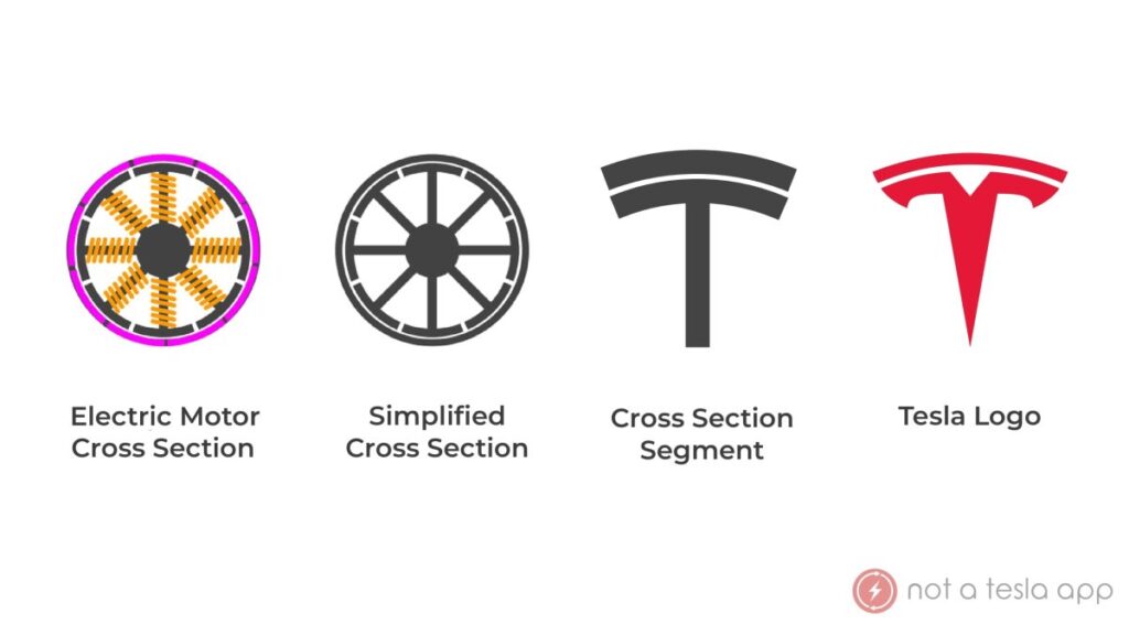
The Tesla logo is not just a mere letter “T,” as Elon Musk himself has pointed out. It resembles the cross-section of an electric motor, mirroring SpaceX’s logo that symbolizes a rocket’s trajectory.
The upper line of the “T” signifies the stator of an electric motor, while the lower section represents one of the poles of the rotor. Together, they illustrate the fundamental principles behind how Tesla’s electric vehicles operate, drawing inspiration from Nikola Tesla’s groundbreaking work on induction motors.
Furthermore, Tesla’s minimalist logo reflects the company’s ethos of simplicity and elegance in design, mirroring the approach they take towards their products.
The Evolution of Tesla’s Logo
Over the years, Tesla’s logo has undergone transformations to align with the brand’s evolution. Initially, when the company was known as Tesla Motors, the logo featured the “T” enclosed within a shield emblem, emphasizing safety.
However, as Tesla streamlined its name to just “Tesla” in 2017, the logo underwent a redesign. The shield was removed, and the word “Tesla” was relocated below the “T.” The color scheme also shifted to include red, signifying a fresh chapter for the brand.
The current iteration of Tesla’s logo retains the essence of the 2017 design with subtle modifications, reflecting the brand’s continued growth and innovation.
Standing Among Great Logos
While Tesla’s logo may not always receive the same acclaim as others, its simplicity and depth of meaning place it in the league of exceptional logos like those of the Pittsburgh Zoo, Black Cat, and Sony VAIO.
In essence, Tesla’s logo embodies the brand’s commitment to minimalism and innovative problem-solving, epitomizing their pursuit of excellence in every aspect of their business.

