Reflecting on Tesla’s Leaked V11 Software Prototype
This article will delve into Tesla’s V11 prototype, a highly anticipated update that aimed to revamp the Tesla user interface and introduce new module features to Tesla’s operating system.
The release of this update was anticipated around the holiday season, following the trend of previous major updates like v9 and v10.
However, before the update could officially launch, it was leaked online by an individual who discovered a Tesla-owned vehicle with a significantly different interface. While leaks are not encouraged, the glimpse of an updated UI sparked excitement among Tesla enthusiasts.
This event took place back in 2021, and in hindsight, it was evident that this prototype was never intended for production. For reasons unknown, Tesla opted against this module design and instead released a more subdued version of what was initially showcased.
The Redesigned UI
The leaked UI presented a radical departure from Tesla’s existing interface, causing a stir within the Tesla community. The interface featured a highly programmatic approach, allowing users to resize apps and place them on their home screen. Each app was interactive, enabling users to select their preferred size and position on the screen. It appeared that users could have one large app, multiple smaller widgets, or a combination of sizes.
The overarching concept focused on customization.
For instance, in the image above, you can see the smaller Maps widget in the top left corner with quick access icons for Home, Work, and Charging. On the bottom left, there was the old Phone app, which provided access to Calendar, Messaging, and Phone functionalities. While these functions have since been separated into individual apps, their core features remained the same.
On the right side of the screen, there was a larger media player. While these apps resembled current offerings, the key difference was the ability for users to run multiple apps simultaneously and customize their sizes and placements on the screen.
Located near the bottom of the screen, between the apps and the dock, was a horizontal line that suggested users could have multiple home screens, akin to a smartphone. This feature would allow users to create different pages for driving, selecting music, or using while parked, among other scenarios.
Although Tesla’s UI has evolved significantly since the unveiling of this prototype, some of these concepts still hold appeal even years later. Presently, users are primarily limited to running one app at a time without the ability to customize its appearance on the screen.
Customizable Dock
In 2021, a customizable dock did not exist, making it one of the noticeable aspects in the leaked photos. Users appeared to have complete control over adding or removing apps from the dock and arranging their positions within it.
What eventually rolled out in v11 was a less customizable but refined version of the Tesla dock. Initially, certain essential options like seat heaters were omitted, but Tesla later allowed users to reintegrate them into the dock through a subsequent update. Presently, users can add favorite apps to the dock, with some slots reserved for permanent icons like Controls and Sound, while the remaining space is filled with recently used apps.
In this concept, users seemed to have full autonomy over managing apps in the dock and their layout within it. The dock itself floated above other UI components, not spanning the full width of the screen as seen today. This design choice enabled apps and menus to appear behind the dock, maximizing on-screen information display.
Regrettably, the method of accessing other apps was not revealed, and we may never discover it. The square-like icon adjacent to the volume button could have served as an app drawer, or it might have been designated for the user’s phone app.
Vehicle Controls
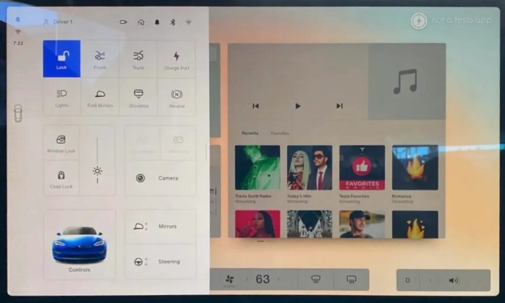
A notable absence was the car icon in the bottom-left corner, typically housing all vehicle settings. Instead, Tesla utilized the car icon on the left side of the screen, also serving as a gear selector. Tapping on this icon revealed the vehicle’s controls.
While not explicitly clear, the grid layout of icons in the Quick Controls menu suggested that these options might have been customizable. Icons such as Lock Car, Frunk, Trunk, Neutral, and others, usually not part of Quick Controls, were visible. Although this customization feature would have been beneficial, it remains uncertain if it was actually implemented.
To access the vehicle’s complete set of controls, users would tap the car icon in the bottom left corner within the Quick Controls section, subsequently opening the full Controls menu.
A noteworthy detail was that when the user tapped the car icon on the left, all widgets on the “home screen” were minimized and dimmed. This meticulous attention to detail indicated that Tesla had devoted considerable time to this design before ultimately shelving it.
Visualization
Conspicuously missing were vehicle visualizations. Given that this was observed on a Model S, the visualizations typically shown on the instrument cluster were absent from the main screen. On a Model 3 or Model Y, visualizations could have been a separate widget that users could resize or hide entirely.
Unfortunately, the UI featured in this prototype was never officially released beyond the Model S.
Status Bar
In this prototype, the icons in the status bar were relocated to the left side, with the remaining icons only visible when Quick Controls were accessed. This design choice mirrors the final version of v11, where most icons were removed from the status bar and only displayed when accessing Controls.
Release
When this prototype was leaked in March 2021, many users anticipated its eventual arrival in their vehicles. However, this anticipation never came to fruition, and the unique UI remained confined to this singular incident. Perhaps one day, Tesla will share the story behind this v11 prototype.
What Tesla eventually unveiled was perceived as a toned-down iteration of this prototype. While it did introduce a customizable dock, it lacked several features seen in the prototype, such as responsive apps and the ability to customize multiple home screens.
This software was demonstrated on a Model S with MCU 3 (AMD Ryzen), although Tesla did not transition the Model 3 and Model Y to MCU 3 until December of that year. The decision to not release this software may have stemmed from concerns about compatibility with older, Intel-based vehicles, market segmentation, and the complexities of maintaining two different user interfaces.
While the concepts showcased in this prototype are undoubtedly intriguing, some aspects, like the customizable dock, appeared less refined and user-friendly compared to what Tesla eventually rolled out. As Tesla evolves into a mass-market vehicle, prioritizing user-friendliness and broad customer appeal is crucial.
Future Features
Although it seems unlikely that this prototype will ever see a public release, the innovative ideas it introduced remain captivating. Tesla could potentially incorporate similar features in the future, enabling users to resize apps, multitask with multiple apps, and personalize their home screens.
Imagine the ability to create multiple layouts for different users, offering an incredibly customizable experience. Hopefully, Tesla will reconsider implementing some of these features in the upcoming UI overhaul.

